Traffic Compared to TSA Screenings
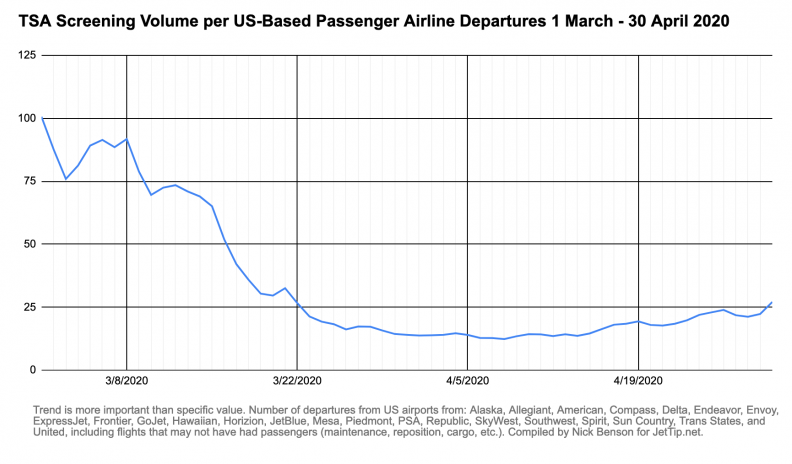
The plots of TSA Screenings / US Passenger Airline Departures continues trending in the right direction; again, the trend here is more valuable that the figure itself, which should correlate loosely with load factors. It suggests that there are more passengers per flight, and theoretically the airlines are losing less money.
Traffic Graphs
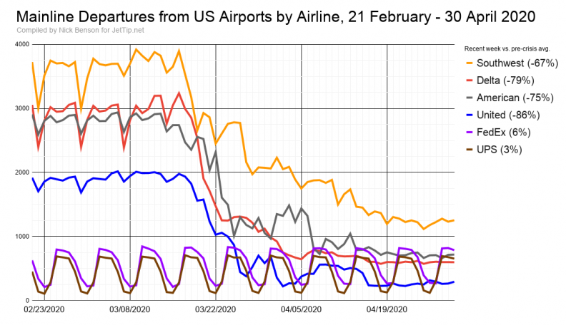
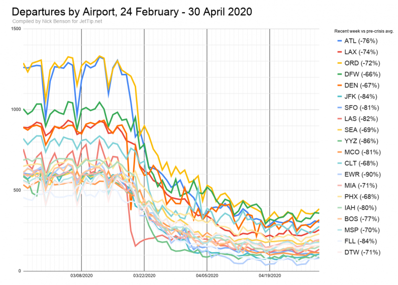
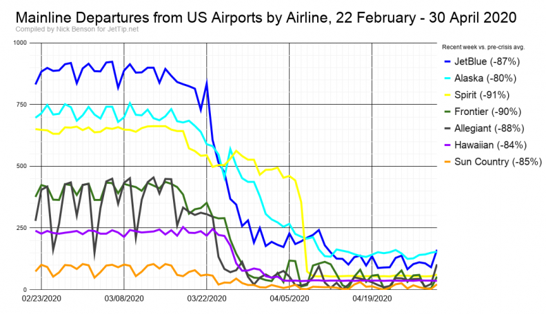
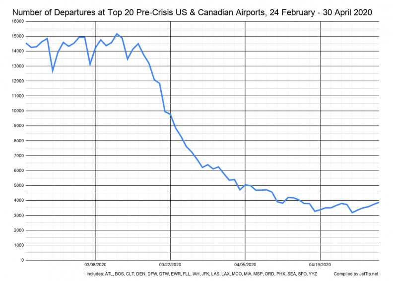
This is the first time a long while that I've compiled stats and not a single airline or airport has set a new post-crisis record - that's a low benchmark, but it's something.
Methodology
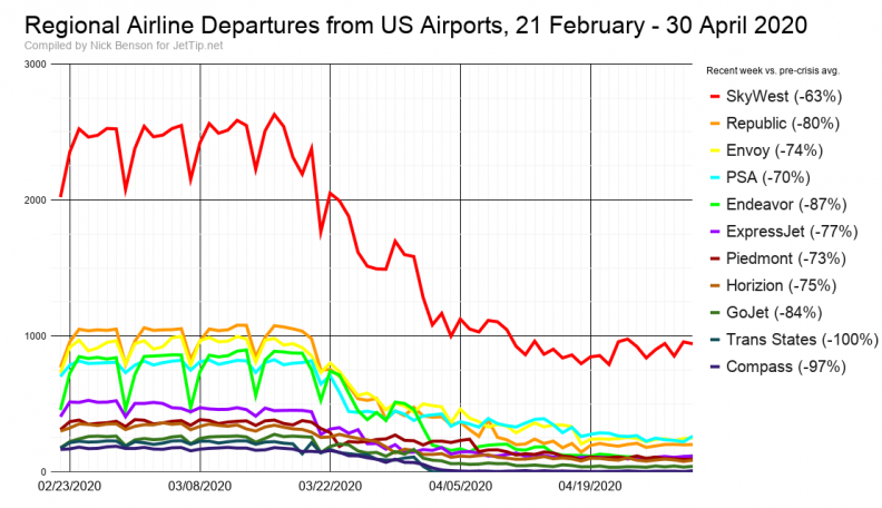
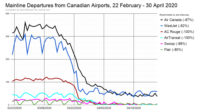
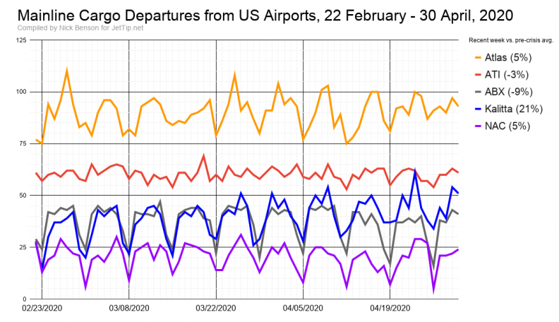
The percentages shown in the charts now reflect the change between the number of departures in the last calendar seven days (ET) compared to the average of two weeks previous to the crisis (last week of February first week of March, roughly). This will better reflect the overall changes to each airline, and will moderate over/under reporting on account of the day of the week the report was created relative to weekly operational cycles.
Additional Aviation News Resources
If you're looking to keep tabs on what's going on, there are lots of great places to be keeping track of aviation news.
- JetTip's Aviation News list with tweets from generally reliable sources
- Coronavirus Flight Cancellation Tracker
- TSA Sreening Volume
- The Air Current
- PaxEx.Aero
- Cranky Flier
- Ethan Klapper's Bluer Skies

Nick Benson
Nick lives in Burnsville, Minnesota with his wife and three children. He grooves on railroad and aviation photography, politics, geography, weather, and LEGO. He started JetTip's smart flight alert service in 2017, and is now a full-time avgeek. He can frequently be found atop a step ladder at MSP's Aircraft Viewing Area.
Recent Posts
NFL 2023 - conference championship round team charter flights
NFL 2023 - divisional round team charter flights
NFL 2023 - wild card team charter flights
NFL 2023 - week 18 team charter flights
NFL 2023 - week 17 team charter flights
News
JetTip Features, Trip Report, Special Liveries, Events, COVID-19, Press Releases
Airline
Delta, Icelanndair, Sun Country, UPS Airlines