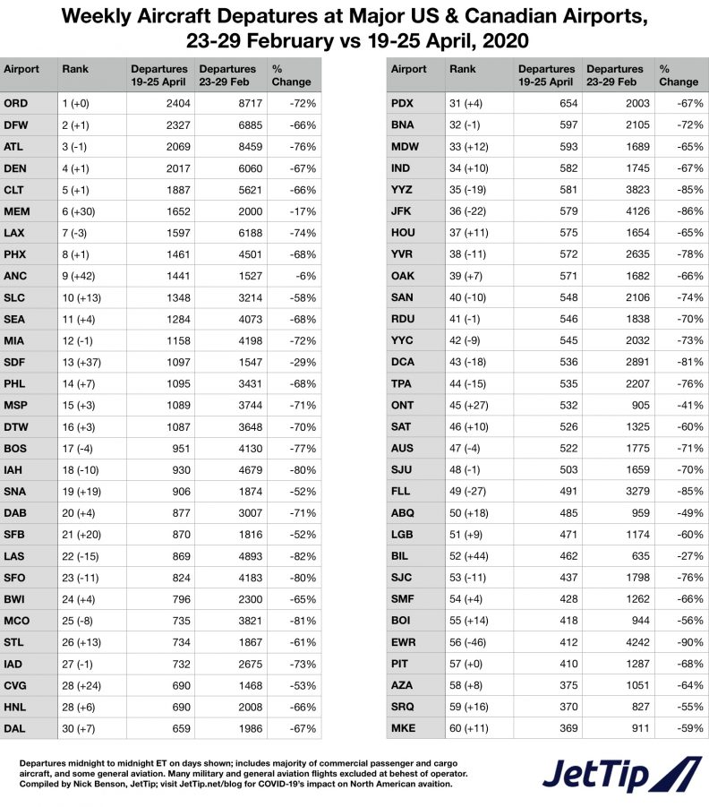
Traffic Ranks
Here's an improved table of airport traffic ranks, comparing the change in the total number of departures from major US and Canadian airports from the week of February 23 and April 19. By including traffic for the whole week we get a better picture of what traffic trends really are, and moderate the effect of weekly cycles in traffic. For example, it was widely reported that Anchorage was the busiest airport overall on Saturday (which is a slow day for passenger traffic), but is ninth busiest according to our data.
The top ten airports last week were ORD, DFW, ATL, DEN, CLT, MEM, LAX, PHX, ANC and SLC; MEM, ANC, and SLC bumped out IAH, EWR and LAS from the pre-crisis top ten.
No surprises here, Memphis, Anchorage, and Louisville continue to do well based on the volume of cargo they're handling, keeping their traffic relatively strong. The most extreme change in rankings is Newark, which dropped from number 10 before the crisis to 56th last week.
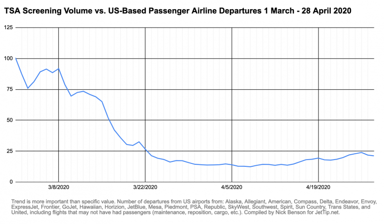
Traffic Compared to TSA Screenings
This is a chart where the trend is more interesting than the value being shown; here we're comparing the number of TSA screenings (which contains more than just passengers) divided by the number of departures from most of the US-based passenger airlines. While not a perfect measure of the number of passengers (TSA screens staff in addition to the traveling public), nor a perfect measure of the number of flights departing the US (some of the flights counted didn't have passengers on board, and some passengers flew more than one leg), the change in the ratio is interesting nonetheless, and suggests the number of flights per passenger may have bottomed out already.
Again, this is an imperfect measure of the number of passengers per flight, but it should be a relatively reliable proxy, and I think the trend it shows could be genuinely helpful.
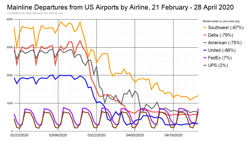
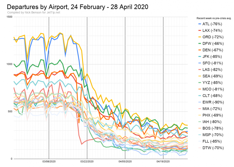
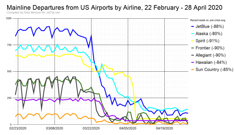
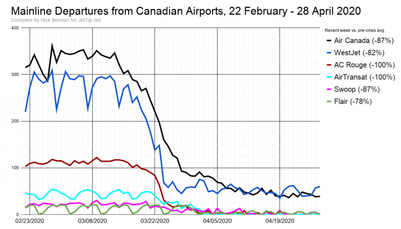
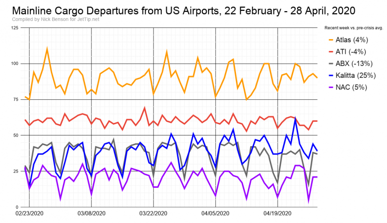
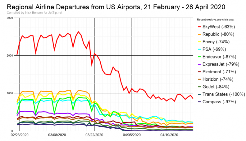
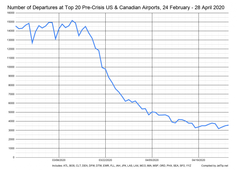
Traffic Graphs
American set a new post-crisis traffic low on Tuesday, as did Endeavor and Mesa. Returning readers should take note that the percentages mentioned in the graphs are now based on weekly numbers, not daily numbers.
Methodology
The percentages shown in the charts now reflect the change between the number of departures in the last calendar seven days (ET) compared to the average of two weeks previous to the crisis (last week of February first week of March, roughly). This will better reflect the overall changes to each airline, and will moderate over/under reporting on account of the day of the week the report was created relative to weekly operational cycles.
Additional Aviation News Resources
If you're looking to keep tabs on what's going on, there are lots of great places to be keeping track of aviation news.
- JetTip's Aviation News list with tweets from generally reliable sources
- JetTip's realtime diversion tracking page
- Coronavirus Flight Cancelation Tracker
- TSA Sreening Volume
- The Air Current
- PaxEx.Aero
- Cranky Flier's Daily Update
- Ethan Klapper's Bluer Skies

Nick Benson
Nick lives in Burnsville, Minnesota with his wife and three children. He grooves on railroad and aviation photography, politics, geography, weather, and LEGO. He started JetTip's smart flight alert service in 2017, and is now a full-time avgeek. He can frequently be found atop a step ladder at MSP's Aircraft Viewing Area.
Recent Posts
NFL 2023 - conference championship round team charter flights
NFL 2023 - divisional round team charter flights
NFL 2023 - wild card team charter flights
NFL 2023 - week 18 team charter flights
NFL 2023 - week 17 team charter flights
News
JetTip Features, Trip Report, Special Liveries, Events, COVID-19, Press Releases
Airline
Delta, Icelanndair, Sun Country, UPS Airlines